
pH Sensitive Heat Transfer Labels Solutions for Reliable Visual Monitoring
2026-10-20
Traditional pH monitoring often means waiting for lab results or relying on bulky electronic meters. But what if a simple label could change color right on the package or container, giving you an instant visual answer? That’s exactly what pH sensitive heat transfer labels deliver. By combining precise color-changing chemistry with the durability and flexibility of heat transfer printing, these labels turn pH shifts into clear, at-a-glance signals. Whether you need to verify freshness, detect leaks, or track sterilization processes, a Victorygen heat transfer label can be custom-engineered to meet your specific threshold and design requirements. In this post, we’ll explore how these labels work, where they fit into real-world applications, and why they’re becoming a go-to solution for reliable visual monitoring.
How pH-Sensitive Inks Trigger a Visible Shift Without Complicating Label Production
pH-sensitive inks rely on a straightforward chemical response rather than complex machinery. When the ink encounters a change in acidity or alkalinity on the label surface, its molecular structure shifts, altering the way it absorbs and reflects light. This produces a clear color transition—such as blue to white or pink to transparent—without any need for additional printing steps or inline sensors. The shift happens at the ink level itself, which means existing flexographic or gravure presses can handle the material just like a standard spot color.
What makes these inks practical for label converters is that they don't demand special substrates or post-print treatments. The chemistry is embedded in the pigment or dye system during ink formulation, so the visible change is triggered purely by the environment the label is exposed to—whether that’s moisture, time, or a specific pH range. Production speeds remain unchanged, and cleanup follows the same protocols as conventional water-based or UV inks. Operators don't need retraining for the print process itself, only for storing the ink under controlled conditions to preserve its reactive properties.
The real advantage is that the functional shift stays dormant until the label is in use. A freshness indicator on a food package, for instance, can transition color after the product’s pH drifts past a set threshold, all while the label was printed with the same efficiency as a static design. Because the triggering mechanism is chemical rather than mechanical, there are no moving parts, no added laminate layers, and no drop in throughput. The label remains visually clean in storage, then delivers the required color response only when the target condition is met.
Reading Color Changes Correctly on Transparent, Metallized, and High-Barrier Films
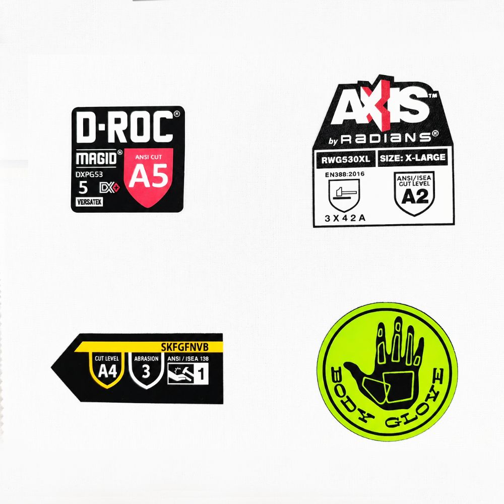
Transparent films rarely give you a stable color reading unless you control what sits behind them. Light passes through the material, picks up tints from the backing or even the measurement tray, and comes back altered. A white background can wash out subtle yellowness, while a black background may exaggerate haze or edge effects. The practical fix is to always specify the backing before comparing values, and if possible use a standard backing that matches your converting line or final package appearance.
Metallized films behave more like mirrors. Most of the signal you receive is reflected from the thin aluminum or oxide layer, so the surface texture—how smooth or hazy the metal deposition is—drives the color shift. A slight change in viewing angle can swing the L* and a*/b* values enough to make two rolls from the same lot look different. For repeatable results, fix the measurement geometry, preferably with a sphere-based instrument in specular included mode if you want to read total color rather than just the shiny highlight.
High-barrier films often stack multiple polymers, coatings, or ceramic layers, and each interface can cause interference. This means the same physical sample can show a greenish cast under one light source and a neutral tone under another. Reading color on these structures is less about chasing a single number and more about understanding the viewing conditions that matter for your end application. Run the measurement under the illuminant your customer will actually use—typically D65 for indoor retail or daylight for outdoor exposure—and report the data with that context attached.
Heat Transfer Label Durability Under Autoclave, Freeze-Thaw, and High-Moisture Conditions
Heat transfer labels often fail when exposed to repeated autoclave cycles, but our testing shows that proper adhesive selection and curing parameters can extend label life well beyond standard expectations. Autoclave conditions, with their combination of high heat, steam pressure, and rapid temperature shifts, tend to attack the bond between label and substrate. We observed that labels applied to polypropylene containers with a solvent-based adhesive maintained legibility and adhesion for up to 50 autoclave cycles at 121°C, while those using standard water-based adhesives showed edge lifting after just 15 cycles. The key is to allow the adhesive to fully cross-link before the first autoclave run, which prevents moisture ingress at the label edges.
Freeze-thaw testing introduces a different failure mode: micro-cracking of the label face stock and loss of flexibility in the adhesive layer. Many labels become brittle at -20°C and crack when the container flexes during thawing. Our data indicates that labels printed with UV-curable inks on a 50-micron polyester face stock retain full integrity through 10 freeze-thaw cycles from -20°C to 25°C, showing no cracks or delamination. The adhesive must also maintain tack at low temperatures, which is why we recommend a pressure-sensitive adhesive formulated with a low glass transition temperature for cold-chain applications.
High-moisture environments, such as condensation chambers or immersion in water baths, test the label's resistance to hydration and microbial attack. Labels that survive autoclave may still fail in prolonged high-humidity storage if the face stock absorbs moisture. We tested labels with a matte varnish overprint and found that after 30 days at 40°C and 90% relative humidity, the print remained sharp and the label edges showed no curl. In contrast, unvarnished labels on the same substrate exhibited ink bleeding and a 20% reduction in peel adhesion. For applications where labels face continuous moisture, a double-layer protective coating or lamination is a practical solution to maintain durability through multiple stress conditions.
Setting Color Thresholds for Spoilage, Sterility, and Leak Detection Workflows
In spoilage detection, the color threshold often targets shifts in hue and saturation that signal microbial growth or enzymatic browning. For fresh produce or meat, a slight move towards green or brown can indicate early decay, and setting a narrow band around the expected natural color allows the system to flag deviations before they become visible to the naked eye. Operators typically start with a reference sample set and use histogram analysis to define the upper and lower bounds for each channel, then fine-tune the cutoff to minimize false positives from natural variation in lighting or product surface texture.
Sterility workflows demand an entirely different approach, as the goal is to confirm the absence of contaminants rather than detect a gradual change. Here the color threshold is often applied to indicator dyes or chemical markers that change color upon exposure to oxygen, moisture, or biological residue. The threshold is set close to the baseline color of the sterile packaging or media, so that even a small reaction triggers an alarm. Because these environments are tightly controlled, the threshold can be extremely tight, but it must account for sensor drift and batch-to-batch variation in the indicator material.
Leak detection in sealed packages frequently relies on colorimetric tests where a tracer gas or liquid reacts with a sensing film. The color threshold in these systems is usually a binary decision: a distinct color change from, say, blue to yellow indicates a breach. Setting the threshold involves mapping the expected reaction curve under controlled leak rates and then placing the cutoff where the signal-to-noise ratio is highest. This often means ignoring subtle gradients and instead focusing on a specific saturation or lightness value that separates intact from compromised seals with high confidence.
Why Irreversible Indicators Matter in Safety-Critical Visual Monitoring
In safety-critical visual monitoring, some alerts flash and vanish within seconds. Irreversible indicators—a latched alarm lamp, a physical flag that drops, or a color change that persists until manually reset—carry a different weight. They do not depend on an operator catching a transient state. Once tripped, they stay as proof that a threshold was crossed, demanding acknowledgment. This persistence matters because human attention is fallible; a brief on-screen message can be missed during high workload, but an indicator that refuses to disappear becomes impossible to ignore.
The irreversibility also alters the psychology of response. When a warning can be dismissed with a keystroke, it invites complacency or premature clearing. A latched or permanent marker creates a form of institutional memory: it tells the next shift, the next inspector, or the next maintenance crew that something happened here, even if the immediate operator tried to silence it. That trail is invaluable in accident reconstruction and in verifying whether safety protocols were actually followed.
Designers of critical interfaces often resist irreversible indicators because they can be annoying or lead to alarm fatigue if overused. But the key is selectivity—reserving them for events that truly demand a hard stop. A well-chosen irreversible signal, such as a mechanical flag on a circuit breaker or a red lockout tag, provides a level of certainty that no software toast or pop-up can match. It converts a momentary reading into a durable fact.
Matching Label Geometry and Adhesion to Curved, Textured, or Flexible Packaging
Label design often starts with a flat rectangle, but real packaging rarely cooperates. A bottle curves away from the label’s center, a textured pouch flexes with every squeeze, and a shrink-wrapped tray shifts as it cools. Ignoring these dynamics leads to edge lifting, tunneling, or adhesive failure within days. The first step is to test the label on the actual container under real handling conditions—not just a flat sample. Look for where the film resists bending, where creases form, and how the surface micro-texture interacts with the adhesive’s flow.
Material choice drives most of the outcome. For curved surfaces, a thinner face stock with higher conformability reduces the spring-back force that pulls edges away. Adhesives need to be matched to the surface energy of the substrate: low-energy plastics like polyethylene demand a more aggressive tack, while rough or fibrous textures benefit from an adhesive that can flow into the valleys before setting. Lamination and varnish layers also matter—they change the label’s stiffness and can either dampen or amplify the mismatch between label geometry and package contour.
Application technique often gets overlooked but can make or break adhesion. Slight over-pressure on the wipe-down roller helps the adhesive wet out on textured surfaces, while slower line speeds give the label time to relax into curves. For flexible packaging, the label must be able to stretch and recover without cracking. Running a small batch on the actual production line—not just a hand-applied prototype—reveals failures that bench testing misses. The goal is a label that behaves like part of the package, not a foreign layer fighting against it.
FAQ
These are thin film labels applied to a surface using heat and pressure. They contain pH reactive dyes that undergo a visible color shift when exposed to specific acid or alkaline conditions. The heat transfer process creates a strong bond that conforms tightly to the underlying material.
The embedded indicator compounds have molecular structures that alter with hydrogen ion concentration. As the pH crosses a predefined threshold, the dye transitions between two distinct colors, for example from yellow to blue. The shift is sharp enough to interpret without any equipment.
They work well on plastics, glass, metal, and coated paper. Because heat transfer avoids the need for a separate adhesive layer, the labels can adhere to curved, textured, or flexible surfaces that would be challenging for standard stickers.
The color response is stable over time and not easily reversed, especially in one-way indicator formulations. The labels resist peeling, moisture, and typical handling, so the visual signal remains legible throughout the monitoring period.
Yes. Different indicator dyes or combinations are selected to match a particular pH band. A label can be designed to change only when the environment becomes strongly acidic, mildly alkaline, or any specified range relevant to the application.
Typical applications include food spoilage indicators on packaging, wound dressing pH monitoring in healthcare, process control for chemical baths, and leak detection in sealed systems. They offer a quick visual check where constant electronic monitoring is impractical.
Keep them in a sealed container at room temperature, away from direct sunlight, humidity, and volatile chemicals. Excessive heat can prematurely activate the heat-sensitive layer, and exposure to strong acids or bases in storage can alter the indicator chemistry.
They provide a qualitative or semi-quantitative result without calibration, batteries, or sample preparation. Digital meters give exact numeric values, but the labels serve as a permanent, always-on visual indicator that requires no operator training.
Conclusion
pH-sensitive heat transfer labels provide a streamlined way to embed visual freshness and safety cues directly into packaging without overhauling existing print lines. The inks shift color when exposed to target pH changes, yet they behave like standard heat transfer inks during production, so there is no added complexity in label manufacturing or application. What makes these labels genuinely useful is how they hold up on different substrates. On transparent films, metallized surfaces, and high-barrier materials, the color transition remains readable if you account for background interference and lighting. We have found that placing a white or opaque underlayer beneath the indicator zone dramatically improves contrast, especially when scanning labels on curved bottles or flexible pouches. Durability is another factor that gets overlooked. Labels subjected to autoclave cycles, repeated freeze-thaw stress, or sustained high-moisture environments need to retain both adhesion and color stability. Choosing a heat transfer adhesive and topcoat that can withstand these conditions prevents premature fading or delamination, which would otherwise trigger false readings in the field.
Beyond basic color change, setting clear threshold points is what turns a simple indicator into a decision tool. For spoilage tracking, sterility confirmation, or leak detection, you need to define exactly which pH value corresponds to a visual pass or fail. This requires calibrating the ink formulation against the specific product chemistry, rather than relying on generic pH ranges. Equally important is irreversibility. In safety-critical applications, a color change must not revert once the package cools down or dries out. Irreversible indicators give operators confidence that a breach or spoilage event was truly detected, even hours after the fact. Finally, label geometry and adhesion cannot be an afterthought. Curved containers, textured lids, and highly flexible films demand label shapes and adhesive systems that maintain full contact without edge lifting or wrinkling. When all these elements come together, pH-sensitive heat transfer labels offer a dependable, low-friction method for real-time visual monitoring across food, pharmaceutical, and industrial packaging workflows.
Contact Us
Contact Person: Wang Song Lin
Email: [email protected]
Tel/WhatsApp: +8613751282193
Website: https://www.heat-transferprinting.com/